Thursday 14 December 2017

Comparison of Video adverts


PowerPoint based on the four video adverts that are based around helping those in poorer countries without any water. Follow up from the main video we studied Water aid.


Thursday 30 November 2017

Straight Outta Compton vs I, Daniel Blake

This is a brief analysis of the two films were studying at the moment, Straight outta Compton and I, Daniel Blake. The PowerPoint includes a brief descriptive of them both and an analysis on film institutions in general.

Monday 6 November 2017

Own photographs taken in green screen room

 These are my two images taken, which would be used to create my very own horror poster. We made four small thumbnails showing what our designs would end up looking like, giving us a nice starting point when we actually got started. The first poster I wanted to create was a scarecrow inspired poster so I had Daniel pose as though he's being held up by the cross there usually held up on, I could of maybe had him running with his face looking back so I didn't have to receive one from the internet but I liked this picture, its suitable for my poster and it ended up looking like what I had in mind.

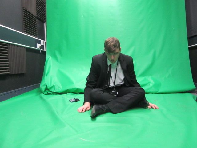
 This is the second picture I took which would end up being a puppet inspired poster, I had him sitting on the floor looking up at the camera which worked out well , in the actual design of this poster I'm going to enlarge him and have some puppet strings above him which adds to that effect of it being puppet inspired. Again don't have any issues with this photo so hopefully the design will look like how I want it to.


Screenshots on how I created my design


This is to back up my design I've screenshot-ed the tools that were most important when creating my poster, it just has a brief explanation on what i think about it and why I've used it.

Own Horror poster designed in Photoshop


Following up from the four horror inspired thumbnail posters that we cerated, I've used that as a starting curve to design my very own horror poster. There are two designs both following the same theme but the bottom design has more to it. But first this is my first design, the them I decided to go with was a scarecrow inspired horror poster, using the pictures I took in the green room I've used them to create my very own scarecrows that are attached to the original cross that there normally on. I didn't really want it to be a very close up image instead I decided to make it more open so I could add more things to the background. The colours are very simple as well to make it more like the 60's posters I could of used more bright colours that they used but it could link with the more later posters seeing as the colours are really dull and dark. Im happy with this design, some areas could of been used to make it more like the posters we've been looking at but it does have all the things that an original horror poster has like blood, a female and a so called villain or monster which in this case are the scarecrows. The main thing that makes this design a whole is the filter it has on it which is cutout giving it that kind of comic effect and the little things like the crows and the pitchfork just adds to the design making it more interesting. 


With the other design I changed a few things, the filter was one thing I changed which was something I was told would make it look like more of the poster we were looking at, which was called palate knife making it look more like its been painted in a way. Ive added more blood around the scarecrows and at the car, also I got triples of blood dripping down and put them behind the fence which is a neat feature in my opinion, it all just adds to the idea that its a horror poster. I was given advice about the color of the fence changing it from brown to black which is a nice change and the text has a red stroke around it instead of a black which ties in with the whole horror theme. To make it more like an actual movie poster I added some stars to it which shows who is actually in it, not a massive change but some nice features were added. Next time if we make a new one I think I'm going to take inspiration from these with the fact that the filter cutout was better in my opinion and the new features like the blood, red outline and the black fence post from the other design was also better, merging these to ideas together could provide me with a much better design. I didn't really think putting an age requirement on there because then it wouldn't link to the codes and conventions of those in the 50's and 60's.

TV adverts costs

This is a very rough diagram of the different adverts that were shown at these specific times. I only decided to focus on on programme at each time which were divided up into times of he day so like morning, afternoon and night but some like in the morning I couldn't really do because id didn't have time but around tea time I jotted down the ones that were on. There were some thing were I thought "oh yeah"theres a reason for that, Ch5 around 5-6pm was showing the show home and away which is intended for those of the older age and the adverts they were showing were adverts like skin care and boots, which is also stuff that is mainly targeted at those who are older. The Simpsons at the same time kids are going to be sitting down watching telly possibly with their parents so what a better way for them to make money and promote things that are targeted for those particular people, mainly kids stuff so when they see it they're like "oh mum look at this" and then there parents are going to want to buy it. ITV at 5-6 pm and 7pm were showing programmes like the chase and emerald shows that are normally watched by older people seeing as there usually around in the house by then as middle aged people are normally getting home around then, what a better way to promote things like homeware, food, gala bingo which is all targeted at those who they're expected to watch the programme. BBC1 and BBC2 were basically the same on their adverts which weren't that often would usually contain indents made to promote the actual channel.


This is the link to the website that I found really insighting when discovering what it actually costs to make the adverts in between each show, I found out that shows like CH4 and CH5 were much cheaper than ITV which isn't really surprising because more people watch ITV compared to the other channels.

Thursday 2 November 2017

History timeline of Horror movies

This task was actually very enjoyable in my opinion, looking through all the different eras and discussing the difference of their horror poster was very interesting, looking through the  posters  the changes start to become very obvious.


Tuesday 31 October 2017

Theories- Media language

Roland Barthes//Semiotics//
  • Barthes believes in the idea that texts communicate their messages through a process of signification and that the idea that signs can function at the level of denotation, which involves the literal or common sense meaning of the sign, and at the level of connotation which involves meanings associated with or suggested by the sign. 


  • His theory could link to the Adele and Kendrick Lamar music covers that we studied, with the way they had a main title for their music cover, for Adele it was 25, just a simple title which communicates her hidden message through a process of signification, that signification is the true meaning behind her music album cover. Its the same with the Kendrick Lamar music cover, he has a hidden message within it and his text communicates that message. The two music overs also contain denotations and connotations, the obvious things that you can see that was on the cover and the connotations which was the hidden messages and what all the things that were specifically put there actually mean, which is exactly what we studied about within the task about Adele and Kendrick Lamar.

Tzvetan Todoror//Narratology//
  • Todoror believes in the idea that all narratives share a basic structure that involves a movement from one state of equilibrium to another. He also believes that in the way narratives are resolved can have a particular ideological significance.


  • This theory could link to the water aid advert seeing as he follows the idea that structure involves movement from one state of equilibrium to another, which in my opinion  basically means movement within something means that there must be structure to it for it to carry on, with the water aid advert there is a lot of structure to the advert so they can get their message across which in this case is for them to help the children and get them a better future, without the structure, like the three aims they repeat which they're hoping to achieve, they wouldn't have a target goal.


Steve Neal //Genre theory//

  •  Neal believes in the theory that genres may be dominated by repetition, but are also marked by difference, variation and change. The idea that genres change, develop and vary as they borrow from and overlap with one another. He also believes that the genre of a film is defined by two things, firstly its how much it conforms to a genres stereotypes and conventions and how much the film subverts the genres stereotypes and conventions.  


  • The kiss of the vampire could be linked to this theory in the way he defines the genre of a film on the stereotypes of it, within the movie poster there is s a blonde girl who has been took by the vampire so there is that stereotype of the girl always being the one who needs rescuing, the vampire who is in red suggesting blood and he's about to bite her which conveys the genre horror. But there is s a man who is on the floor looking like he's in need of help and the women is trying to rescue him which basically goes against his theory as society wouldn't associate a man being the one who needs rescuing.

Claude Levi Strauss  //Structuralism//

  • Strauss believes in the idea that texts can best be understood through an examination of their underlying structure and that the idea that meaning is dependent upon (and produced through) pairs of opportunities, he also believes in the idea that the way in which these binary opposites are resolved can have particular ideological significance.


  • The topic I think this theory link to is The kiss of the vampire, the reason for this is because the movie had a vampire as the villain and a man supposedly to be the hero but that's just how people perceive it stereotyping women being the ones that always need rescuing but in this case it is the man who needs rescuing as he's on the floor and the women is the ones who's fighting the vampire which goes against that stereotype. But there is always a villain and a hero without these there wouldn't really be a film, its all about how binary opposites are depended upon in things, without even knowing the genre of a film you can perceive what it is by looking at the characters and seeing if there's the villain character and the supposed hero. But you could rely on the codes and conventions, what we are expecting to see on a horror poster and what actually is there, we expect to see a man vs some kind of supernatural creature but this time its a women vs the creature. Pairs of oppositions which basically means Good vs evil.

Jean Baudrillard //Postmodernism//
  • Baudrillards theory contains the thought that the idea in postmodern culture the boundaries between the 'real' world and the world of media have collapsed and this it is no longer possible to distinguish  between reality and simulation. In postmodern age of simulacra we are impressed in a world of images which no longer refer to anything "real". Also that media images have come to seem more "real" than the reality they supposedly represent (hyper reality).

  • There are two topics this theory could link to in my opinion, firstly it could link to the tide print advert, the idea that she has about how media is kind of complete different to the everyday things that are going on which she represents as the "real" thing. In the the tide advert it contains a women with red lipstick, hair done up all nice and quite a lot of skin showing which signifies a bit of a sexual theme to the poster, back then women were looked down on if they wore things like the women in the poster, people now would automatically assume that women back then were all like this which wasn't the case but as Jean has said media images have become more "real" than reality, looking at this poster now all women would be represented like this as this is how they're putting women out to be even though maybe women were completely different this. The other topic I think links to this theory is the water aid advert, everybody assumes that the children are all fine when watching the advert as there shown with water and being happy which again there is her theory being shown, media is being more taken serious than actual reality, without that advert people wouldn't of taken any notice, some still don't as they don't perceive the children as being really desperate as the video (media) is showing them with water.


Friday 20 October 2017

Designing Horror Movie Cover

With our assignment of creating out own Horror movie poster we designed four cover that we would get inspiration from when designing, we also went I to the schools green screen to capture out images that we would be using within our designs, I chose the puppet design and the scarecrow design to the photos of, I will be incorporating these images into my design. Im thinking of using the scarecrow design altogether, I like the setup of it with the house on top of the hill and the field of grass I think I could manipulate that into making my own horror poster. I wasn't that fond of the Balloon poster I thought ti was a bit plain and boring and the Zombie Vs Vampires didn't really catch my eye wither, the puppet design is another one I'm thinking of because there aren't that many horror films that consist of Killer Puppets compared to vampire and zombie films. Overall this provides me with a nice start so when it coms to designing I know what I'm doing.

Thursday 5 October 2017

Intertextuality

This PowerPoint is all about the topic intertextuality, what films contain intertextuality and what intertextuality is actually all about.

https://www.slideshare.net/secret/7lEgLzgy9ZaaQR


Water-aid audio visual advert presentation

This is my power point presentation explaining the different media techniques that were hidden within the video advert.


https://www.slideshare.net/secret/pvjPBvOPVx6p4F


Kiss of the vampire movie poster

This powerpoint contains all the media techniques that are hidden in the horror movie poster 'The kiss of a Vampire'


https://www.slideshare.net/benjijohnoo10/kiss-of-the-vampire-analysis-81363469


Tide Print advert

This Powerpoint contains slides based upon the Tide print advert, its like the horror poster, it contains all the hidden techniques within the print advert. Being honest this powerpoint needs improving more, the information could be improved bit more which I will aim to finish soon.

https://www.slideshare.net/benjijohnoo10/tide-print-advert-analysis

Decoded Written by Jay Z & Bing


Decoded written by Jay Z was shown to the world through an idea that hasn’t been used before. With all the pages scattered across the world it was able to view by a lot of people of different ages, genders and ethnicities. With the help from the century Bing it gained more attention due to all of the young people of the world getting aware through social media such as twitter and the internet if he didn’t use Bing for a bit more support than his book wouldn’t have gotten the same reaction as it has with him using Bing seeing as so many social groups are using the internet in todays society. The book itself represents Jay Z personally as interesting and creative as this wouldn’t usually be something that people would associate with him doing. With every page in a specific place representing the story on each of the pages interests and engages more of today’s society. With the alternative ways of media like billboards, plates, T-shirts and a car is more appealing to everyone seeing ass everyone’s used to seeing it on a commercial or the newspaper.


Tuesday 3 October 2017

Denotation and Connotation// Adele and Kendrick Lamar

With this assignment we had to analyse the music cover for Adele 25 and Kendrick Lamar's 'Good kid in a bad city' I discussed the differences between them both and the denotation and connotation aspects of the album covers.

Adele 25 music cover

Looking at this album cover, it is different in certain ways to the album cover of Kendrick Lamar. But looking at Adele's cover there are a few things that people seem to miss when looking at it, there is a more meaningful reason to the design of this album. There are denotative and connotative elements to this music cover which can be seen completely different to everyone. The album itself is in black and white except for the number 25, the reason behind this is because she must want everyone to recognise how long she has been creating music for and that she is appreciative that everyone has stuck by her and listened to her music throughout her years doing it. Looking at the album the main focus is on her face seeing as it covers most of the page, there isn't anything on her face, no jewellery it's just plain and pure which could reflect on the type of music she has produced in this album. There isn't anything else on the music cover just her name in big writing, this signifies that main purpose of this album and how she only wants people to know that this is her, there nothing else to it she's just herself. Adele's eyes are have a hint of relation in them signifying how her music reflects her and her life. 

Kendrick Lamar Good kid in a mad city music cover


Kendrick Lamar's music album "Good kid in a mad city" represents another type of music genre, looking at the album cover the main thing that catches your attention is the title of the album, with putting it in large capital letters must signify the importance of this album to him as normally putting text into capitals usually means they're shouting something and in this case, it’s the title. The cover itself is very dark and depressing which could symbolise the time he had growing up. Kendrick on the album looks like he's thinking or dreaming about something, the use of him playing with his thumbs could also represents him contemplating. Kendrick is coloured so this denotes the type of music he must be presenting in this album which is Rap/R&B music and maybe smooth listening. Looking at Kendrick himself he's dressed quite smart, theres a slight image of a bracelet at the bottom of the cover and his hair is nice and smart, its not all messy its clean and short which connotes that he's wealthy thanks to his music. 

Similarities and differences 


Both of these artists are seeking different audiences and you   
can tell by their different covers, you could say their genders connotes the different audiences they're putting their music out to, but then it could be for both men and women. Adele normally produces music that’s very soulful and looking at the cover it’s very slick and clear which could signify soulful music, the cover doesn’t really give off a Rap vibe which separates their target audience. Kendrick's on the other hand gives off a Rap vibe not just because of the colour of his skin but because of how the album is set out and how he's dressed. There is also a parental advisory label on Kendrick's cover which is there to warn those under age that there is offensive language within the music so that could signify his target audience is aimed at more of the older social groups where as Adele's doesn't consist of any foul language so its open to all ages.


Welcome to my Media Studies blog...

Hello my name is Benjamin Johnson and this is my first blog post on my Media account.....