This is a brief analysis of the two films were studying at the moment, Straight outta Compton and I, Daniel Blake. The PowerPoint includes a brief descriptive of them both and an analysis on film institutions in general.
Thursday, 30 November 2017

Monday, 6 November 2017
Own photographs taken in green screen room

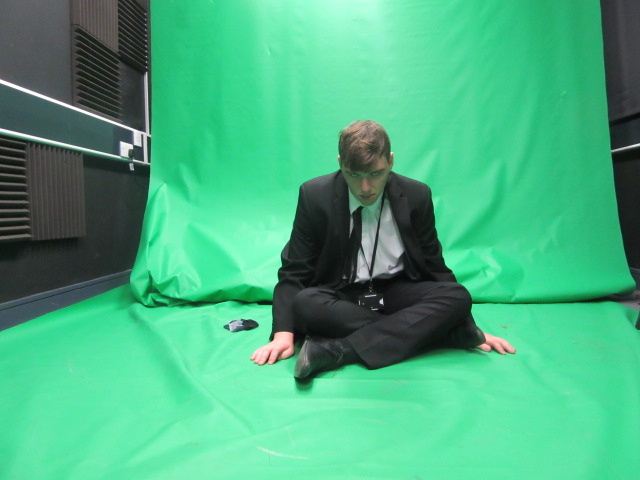 This is the second picture I took which would end up being a puppet inspired poster, I had him sitting on the floor looking up at the camera which worked out well , in the actual design of this poster I'm going to enlarge him and have some puppet strings above him which adds to that effect of it being puppet inspired. Again don't have any issues with this photo so hopefully the design will look like how I want it to.
Screenshots on how I created my design
This is to back up my design I've screenshot-ed the tools that were most important when creating my poster, it just has a brief explanation on what i think about it and why I've used it.

Own Horror poster designed in Photoshop


Following up from the four horror inspired thumbnail posters that we cerated, I've used that as a starting curve to design my very own horror poster. There are two designs both following the same theme but the bottom design has more to it. But first this is my first design, the them I decided to go with was a scarecrow inspired horror poster, using the pictures I took in the green room I've used them to create my very own scarecrows that are attached to the original cross that there normally on. I didn't really want it to be a very close up image instead I decided to make it more open so I could add more things to the background. The colours are very simple as well to make it more like the 60's posters I could of used more bright colours that they used but it could link with the more later posters seeing as the colours are really dull and dark. Im happy with this design, some areas could of been used to make it more like the posters we've been looking at but it does have all the things that an original horror poster has like blood, a female and a so called villain or monster which in this case are the scarecrows. The main thing that makes this design a whole is the filter it has on it which is cutout giving it that kind of comic effect and the little things like the crows and the pitchfork just adds to the design making it more interesting.
With the other design I changed a few things, the filter was one thing I changed which was something I was told would make it look like more of the poster we were looking at, which was called palate knife making it look more like its been painted in a way. Ive added more blood around the scarecrows and at the car, also I got triples of blood dripping down and put them behind the fence which is a neat feature in my opinion, it all just adds to the idea that its a horror poster. I was given advice about the color of the fence changing it from brown to black which is a nice change and the text has a red stroke around it instead of a black which ties in with the whole horror theme. To make it more like an actual movie poster I added some stars to it which shows who is actually in it, not a massive change but some nice features were added. Next time if we make a new one I think I'm going to take inspiration from these with the fact that the filter cutout was better in my opinion and the new features like the blood, red outline and the black fence post from the other design was also better, merging these to ideas together could provide me with a much better design. I didn't really think putting an age requirement on there because then it wouldn't link to the codes and conventions of those in the 50's and 60's.
TV adverts costs

This is the link to the website that I found really insighting when discovering what it actually costs to make the adverts in between each show, I found out that shows like CH4 and CH5 were much cheaper than ITV which isn't really surprising because more people watch ITV compared to the other channels.
Thursday, 2 November 2017
History timeline of Horror movies
This task was actually very enjoyable in my opinion, looking through all the different eras and discussing the difference of their horror poster was very interesting, looking through the posters the changes start to become very obvious.

Subscribe to:
Comments (Atom)